


DaemonsGaraaga-008a
PC-Texture2
Siglerfest2k14F Mock
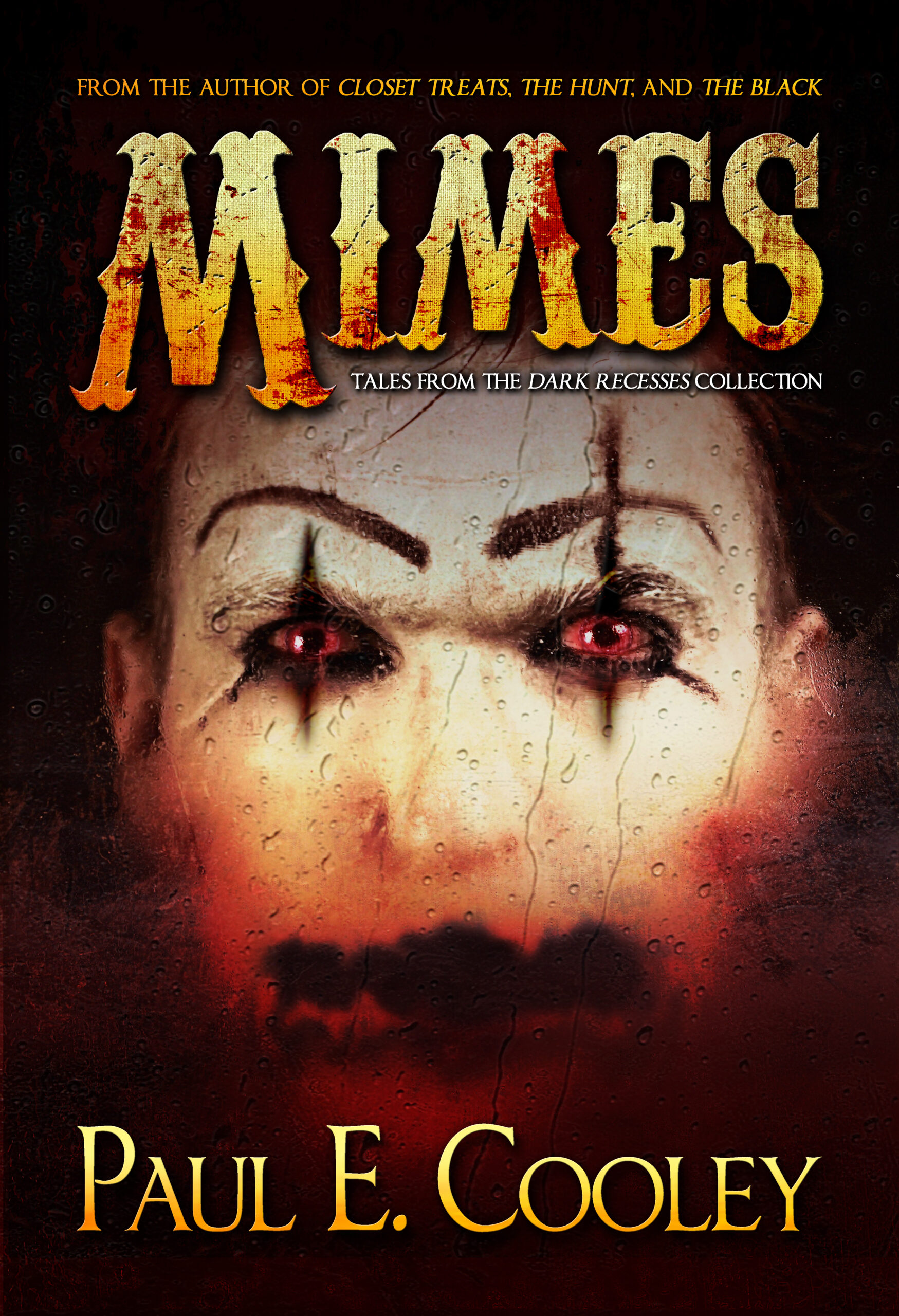
Mimes-01-Front
Nocturnal-Tee
Lamashtu-V02-R03
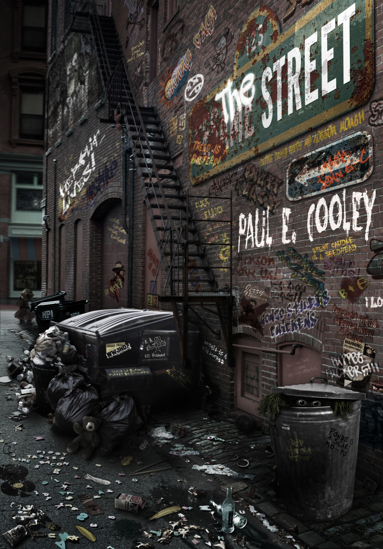
TheStreet-Large2
Drinara Mock
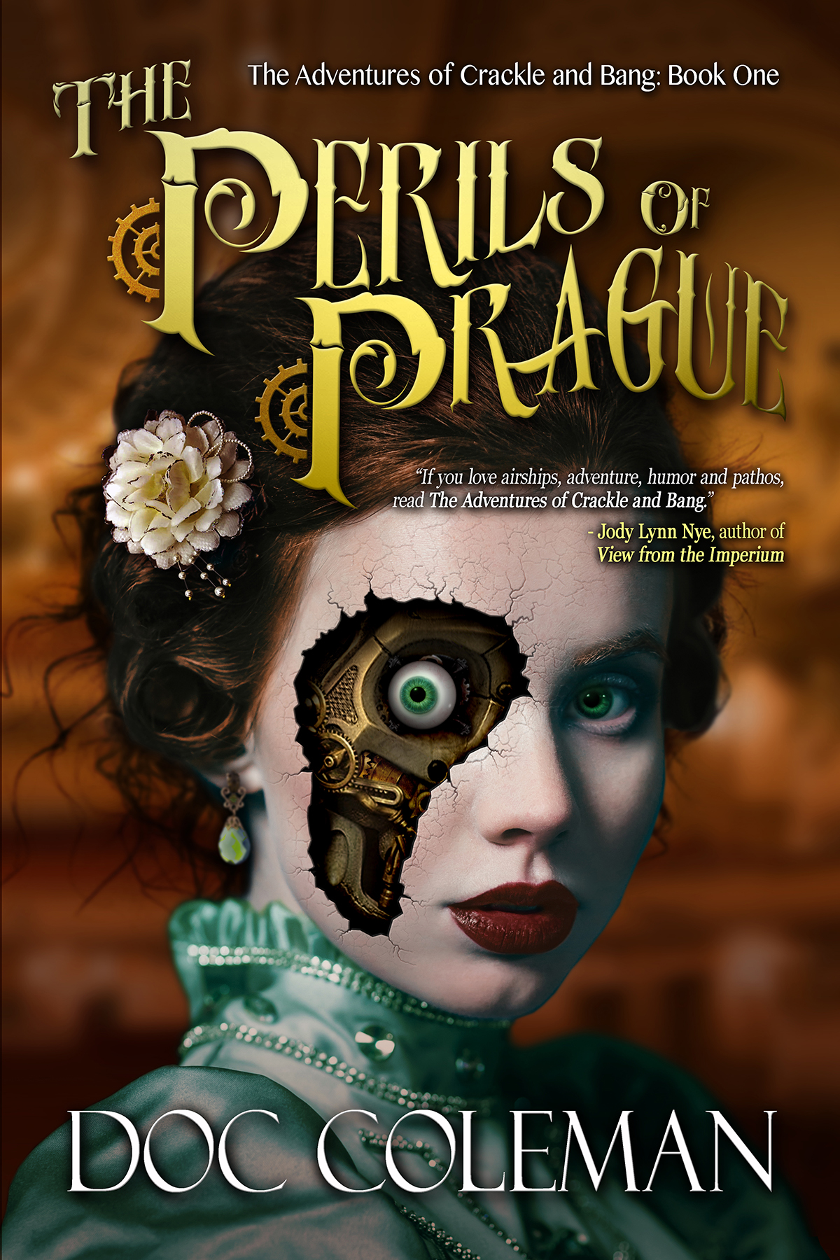
Coleman-V2-011-Front
Cooley-Black-Evolution-004
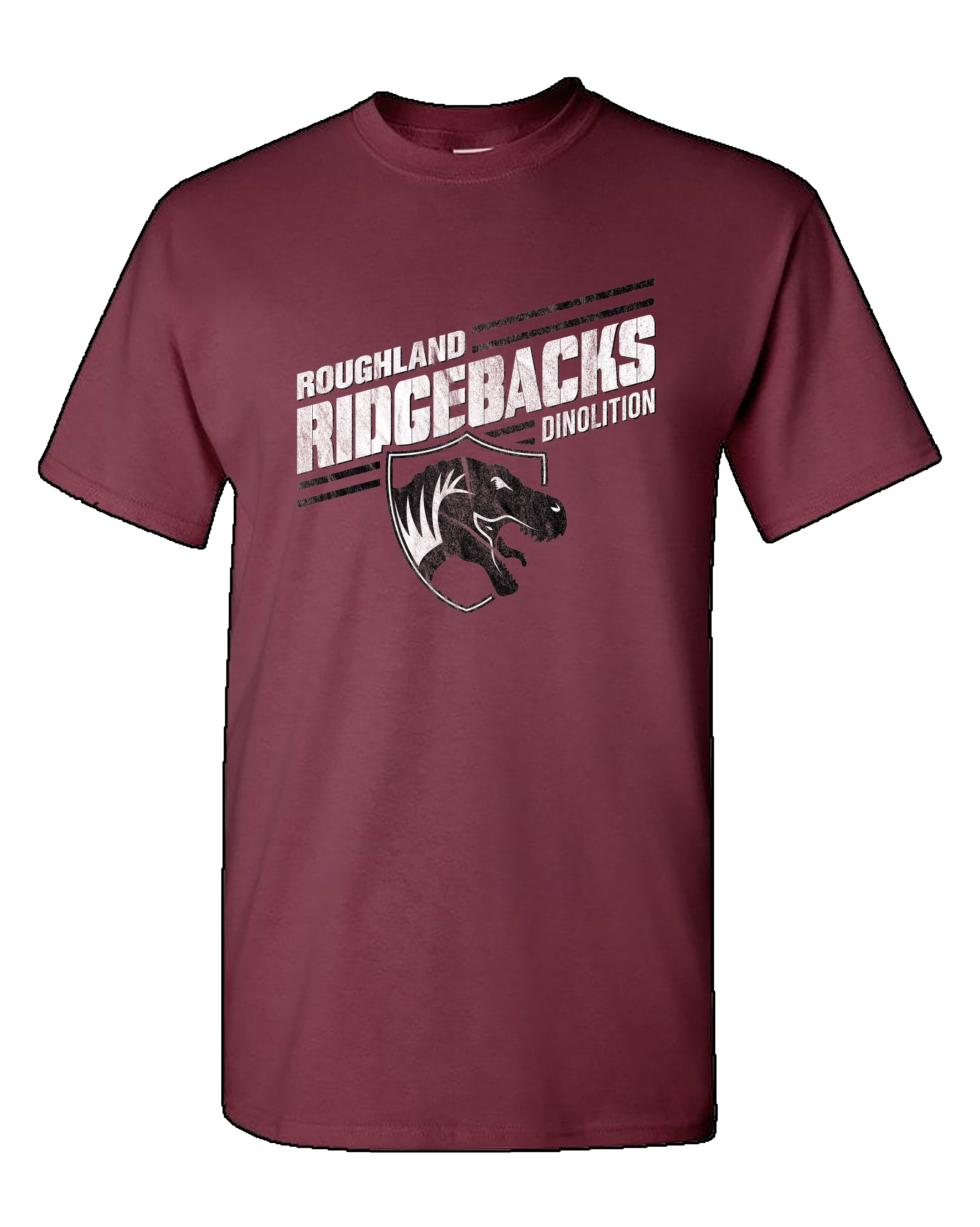
Ridgebacks Mock
FailedCities-WallaceHardcover-Promo-R1
GFLChamps-02
Thumb-EscapePod
Cooley-GheresInferno-Rev01-eBook
GFLChamps-01
PP-Chip2
MattWallace-BJD-04-eBook-750x1200
Dead-Play-Print-12x18
EA-Chip
Sherrod-Cover-PulpSonnets-09
Cover-Cooley-LoG2-Audio
Sigler-FitzRoy-Cover
PseudoPod-Texture
Siglerfest2k19F Mock

Putting together the right cover for a book can be daunting. When it has to represent a collection of linked stories, it becomes even more so. I can’t imagine another artist putting together such a fantastic book design and I guarantee I will be using Scott Pond’s services again.
Paul E. Cooleyauthor of THE DARK and CLOSET TREATS
Mr. Pond reads my work before designing the covers. He is very good at picking out certain scenes and targeting them. Once we agree on the scene, he does his magic. And folks? This man is MADE of magic. Mr. Pond? You have once again knocked it out of the park!
Paul E. Cooleyauthor of THE DARK and CLOSET TREATS

Bringing on Scott Pond to do my covers was one of the best moves I’ve made in my fiction writing career. This cover is mind-blowingly gorgeous and I find myself staring at it for minutes at a time. I could not be happier with this.
Matt WallaceHugo–winning author

I wanted an eye catching cover for my first novel, and Scott Pond delivered in spades! And his work is amazing. The cover was almost perfect on the first render and the quickly and beautifully accommodated the changes I needed. The end result is smashing. I can’t wait to see what he does with my next book cover.
Doc ColemanSteampunk Author

If you need references for Scott Pond’s design work, I’m your guy. Scott is easy to work with, incredibly creative, ingenious, dedicated, flexible… and somehow laid back and easy going during the process. His work is unmatched and exciting and I look forward to each new project.
Scott SiglerNew York Times Best Selling Author
Scott Pond is far and away the best graphic artist and designer I’ve had work on any book with which I’ve been associated. Every aspect of the cover, from the largest visual theme to the smallest font, was given equal time, attention, and detail. I was always presented with a lot of options, my notes were always readily heard and skillfully interpreted, and by the end of the process I had a cover that was both exactly what I had in my head when we began and better than I’d envisioned.
Matt WallaceHugo–winning author

As a publisher, working with Scott Pond is unparalleled: he works fluidly with my creative team, can expertly bring to life any ideas my authors come up with (no matter how nebulous at first) and he has the real-world know-how to correctly deliver high quality work in multiple formats to a myriad of vendors on time and on budget.
A B SiglerEmpty Set Entertainment

Scott Pond was professional, incredibly talented, and a complete and utter pleasure to work with. I look forward to finishing my next book so I can see what he comes up with for that. If you need artwork, you need Scott Pond’s talent. It’s that simple.
Mike Jandreauauthor of A SOUR CHORD and MY LAST DAYS

Amazing work! Scott helped me create my watermark/logo for my new photography business. I love his work! Highly recommended.
Michelle KrausPhotographer
Scott Pond is an indispensable member of my production team for novels, marketing collateral, PR materials, and much much more. His graceful design enhances just about every part of the Empty Set Entertainment milieu and we are better for it.
A B SiglerEmpty Set Entertainment

Working with Scott Pond was easy. He took a vague concept for a logo and was able to deliver quality results that exceeded expectations.
Kelly McArdleTeam Crossfade

Scott Pond was amazing to work with. I gave him what I wanted. He responded. I tweaked. He responded. I tweaked again. He perfected. Sounds simple, which is exactly what the experience should be and rightly so. Great illustrator, great collaborator, and I’d work with him again in a second.
Jake BibleBram Stoker Award nominated and award-winning novelist

Mr. Pond worked with me to design the perfect logo for my Twitch channel. He also created amazing background photos, buttons and a banner, tying an entire theme together. His work made my page look professional, with my personality written all over it. I absolutely love the images he’s created for me, and my logo is definitely one of a kind. I would recommend Mr. Pond to anyone looking for quality workmanship in graphic design.
The only reason I encourage you to hire Scott Pond for your graphic design needs is that I cannot afford to keep him on staff full time. Otherwise, I’d literally chop your f**king hands off to keep his talents to myself. He’s that insane!
Matt WallaceHugo–winning author